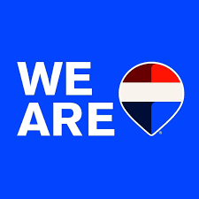
ReMax just revealed their brand-new logo for 2025 at their R4 convention in Las Vegas! The update is all about making Our branding more modern and digital-friendly, so it looks better online and on social media.
The new logo has been getting mixed reactions online. Some people really like the new design, while others are giving it quite a bit of slack. Many fans of the old logo feel that it had a more timeless appeal, while supporters of the change appreciate the modern and sleek approach.
The new design is meant to keep ReMax up-to-date in the new digital world. You’ll start seeing the new logo everywhere, on signs, marketing materials, and all over the internet.
So, what do you think? Do you like the new ReMax look, or do you prefer the old one? Drop your thoughts in the comments!


